Gestalt Psychology in Design
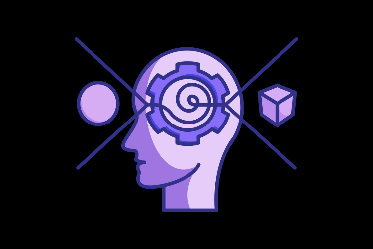
Why do some designs feel intuitive while others seem chaotic and frustrating? The answer often lies in Gestalt principles—psychological rules that shape how we perceive and interpret visual information. Rooted in the idea that we see the world as unified wholes rather than disconnected parts, Gestalt is commonly summed up by the phrase, “The whole is greater than the sum of its parts.” While this may sound abstract, these principles have real, tangible effects on design. From websites to apps and beyond, designers use them to create experiences that feel seamless and natural.
At its core, Gestalt psychology explains how our brains instinctively group elements, recognize patterns, and simplify complexity. Once you understand these principles, you’ll start noticing them everywhere—in branding, interfaces, and even everyday objects.
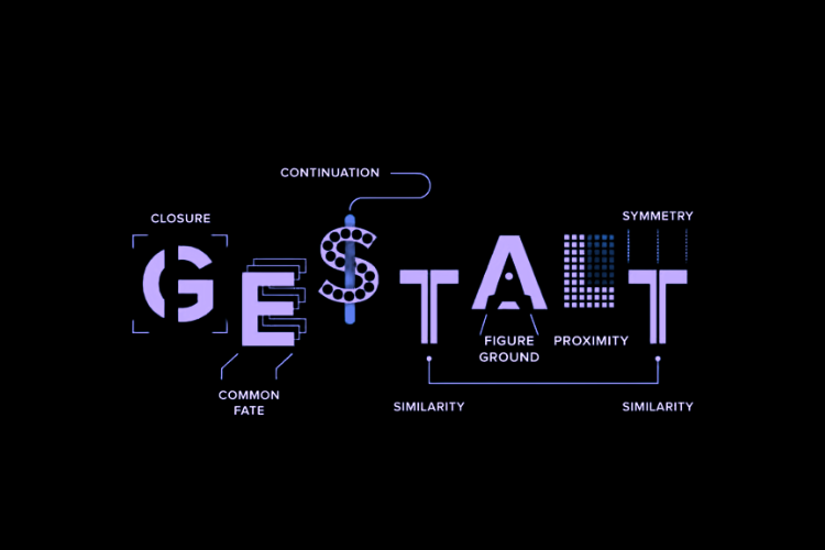
While there are many Gestalt principles, six core ones are particularly essential to design.
Proximity
The principle of proximity states that objects placed close together are perceived as part of the same group, creating a visual relationship between them. This principle is widely used in UI design to enhance usability and reduce cognitive load. For example, navigation menus group related links together, and connectivity controls like WiFi and Bluetooth settings are clustered for quick access. By leveraging proximity, designers guide users intuitively, making interfaces more efficient and easy to navigate.
Similarity
The principle of similarity states that visually similar elements are perceived to be part of the same group. This is a fundamental concept in UI design, helping users quickly recognize related functions. For example, navigation links often share the same typography, color, and spacing to show they are a part of the same system. Similarities in typography and iconography create a feeling of cohesion and unity. This also extends into functionality where a designer will use a certain color for primary actions, and often red for anything destructive. By using similarity properly, designers can create more intuitive and cohesive experiences.
Closure
The principle of closure states that our brains will fill in gaps to perceive incomplete shapes. This is one of the most commonly used principles in logo design. Many recognizable logos use closure to create visually interesting designs such as the famous WWF panda or IBM’s logo. Beyond branding, closure is also used in icon design. By strategically omitting parts of a shape, you can create minimalistic icons that improve clarity while reducing clutter. Closure invites users to interpret designs in interesting ways.
Continuity
The principle of continuity states that our eyes tend to follow lines or curves. This is to say that we have a perception bias to perceive things as connected forms rather than disconnected. This is used in fundamental UI design almost everywhere you look, from the way navigation menus are laid out to progress bars and onboarding sequences, continuity helps subtly guide the user’s eye.
Figure-Ground
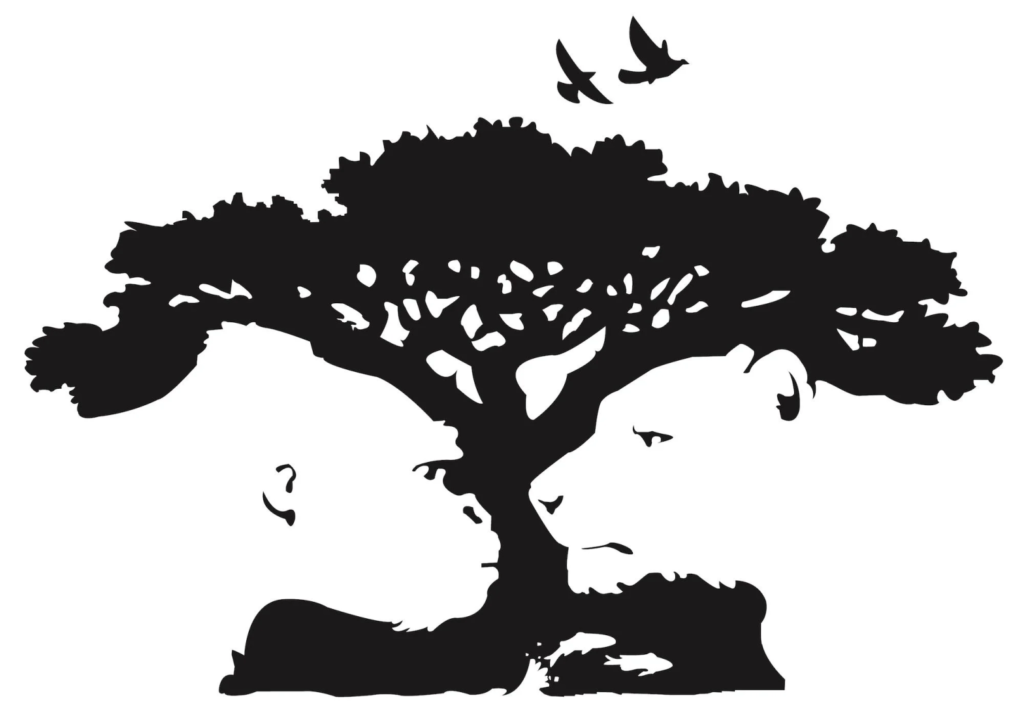
The Figure-Ground principle describes how our brains instinctively separate objects (figure) from their backgrounds (ground). This technique is used extensively in visual design to create emphasis and direct attention. One of the most famous examples of Figure-Ground is the logo for The Pittsburgh Zoo as depicted above. The logo cleverly uses negative white space to create images of a gorilla and a lion. Depending on what your brain perceives as the background and foreground, you either see a tree or the animals. In UX/UI design techniques like lightboxes, where the background is dimmed while the main content remains bright and sharp, ensure users stay focused on key actions. Drop shadows, overlays, and layered UI elements also help establish hierarchy, making important components more visually dominant.
Pragnanz
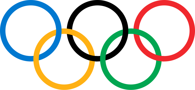
The principle of Pragnanz states that our brains prefer to interpret complex visuals in the simplest, most organized way possible. The most common example of Pragnanz is The Olympic Rings. The Olympic Rings is actually an intricate design made up of overlapping and intersecting lines, however, our brain naturally perceives the symbol as 5 distinct rings that create a sense of order and symmetry. Pragnanz is often used in logo and icon design to reduce visual complexity and improve clarity.
Conclusion
Gestalt principles play a fundamental role in how we perceive and interact with design. By understanding how our brains naturally group, organize, and simplify visual information, designers can create experiences that feel seamless, intuitive, and visually harmonious. Once you start recognizing them, you’ll see Gestalt psychology at work everywhere—from the apps you use daily to the logos of your favorite brands. When we design with these principles in mind, we can make our experiences feel natural and intuitive.
Summary
- Gestalt Psychology
The Gestalt principles are a set of psychological laws that describe how we perceive the world as a whole instead of individual parts. We subconsciously recognize patterns, organize data, and simplify complex images, in order to easily understand the world around us. Designers can leverage these principles to create intuitive and rewarding experiences.